

Creating a Corporate Dystopia With “Severance” Season 2’s Set Decorator David Schlesinger
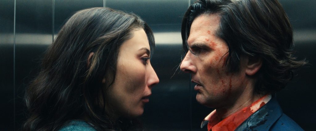
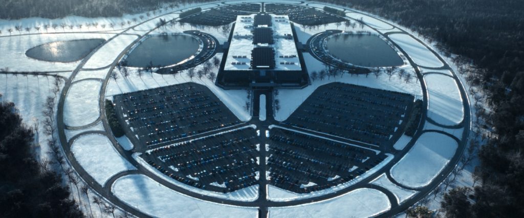
Leading this year’s Emmys pack with 27 nominations, the sophomore season of Severance goes deeper into the cult-like and twisted Lumon Industries, where a group of employees chose a surgical procedure that permanently bifurcates their work memories (“innies”) from their true selves (“outies”). Created by Dan Erickson, the slow-burn workplace thriller follows severed employee, Mark (Adam Scott), and his colleagues who work on the labyrinthine severed floor under the supervision of Mr. Milchick (Tramell Tillman). One of the emotional bedrocks this season centers around what really happened to Mark’s allegedly deceased wife, Gemma (Dichen Lachman). Shot in the Tri-State area, the series received $39.6 million in New York tax credits for its first season and an estimated $9.2 million in New Jersey tax credits across both seasons.
Nominated for an Emmy, set decorator David Schlesinger (John Wick: Chapter 3 – Parabellum, Knives Out) worked closely with production designer Jeremy Hindle (who is also nominated) to expand the singular aesthetic of Lumon, which required fabricating substantial amounts of set dressing locally and importing items from Europe to create the distinct look. “About 30% to 40% of our set dressing was designed and fabricated mostly in the area. We wanted everything to be a little off and not recognizable because, in theory, most of the things on the severed work floor would have been made by Lumon. So that’s why we fabricated so much in-house.”
What was it like to jump right into the second season?
Jeremy Hindle and I are old friends; we did True Story together. He offered me season one, but I was on hold for another project. But I wasn’t sure that I could do it at first, and jumped in with some research and conversations with Jeremy. So, season two was not brand new to me.
What were some of the changes in season two from a visual aesthetic perspective?
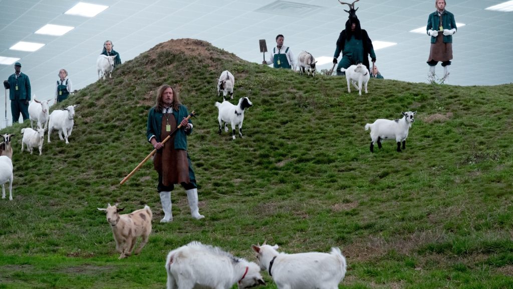
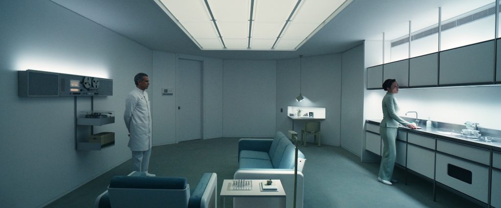
There wasn’t really a change, except that we spent more time in the outie’s world and explored other areas of Lumon, like the testing floor, where we found many new sets. I expanded on season one—I wanted more of a corporate feeling in the furniture. So, we repeated things—you have the same folding chairs from Cappellini everywhere like the break room and the Mammalians Nurturable room, or the goat room. I brought in a drafting table from [Italian office equipment manufacturer] Olivetti, which we used in the Mammalians and the management office and closet to convey that sense of sameness.
How did you settle on that style from Olivetti?
Olivetti made typewriters and business equipment in the ’60s, a line of office furniture which I don’t think was imported into the United States, so it was pretty unusual to find here. I wanted to find things that people didn’t recognize. I thought it was amazing, so I just started buying them up.
What were some of the main locations where Severance was shot?
Our stages were in the Bronx, and we had many locations upstate in Minnewaska State Park, in Kingston, New York. Bell Labs in Holmdel, New Jersey, is where the Lumon building is. And we shot in Newfoundland for Episode 8, that’s set in [the fictional town of] Salt’s Neck.
How big was your team?
My core team included two assistant set decorators and two buyers, plus a coordinator. The set dressing crew could be up to 50 on some days.
Was the style of Severance too unique to rent a lot from prop houses?
We bought a lot because of our schedule and we go back to a lot of sets. So, rentals are a little difficult. We do some but for the most part, we bought items.
How much of the furniture and decorations were sourced on location?
I source all over—New York, New Jersey, Pennsylvania, California, and we also shipped things in from Europe. Wherever we could find things, we went far and wide. We also fabricated a large amount of the set dressing.
What was the design and fabrication process like on a show this extensive?
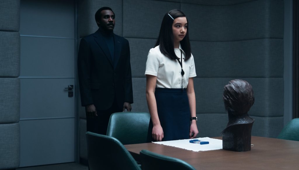
I’d come up with a concept, discuss it with Jeremy, and then work with an illustrator or the set designer. We’d make it in-house or have an outside fabricator, depending on the complexity. We have an in-house sculptor who made the duck rabbit sculpture in Milchick’s office and the bust of Lumon’s founder, Eagan. Our shop space was in the Bronx at our stages.
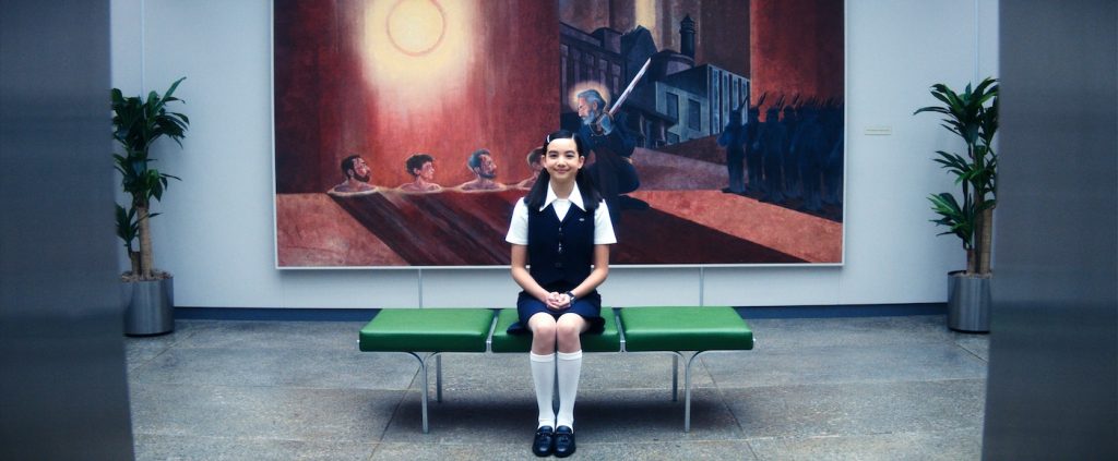
A jarring piece of art greets the innies as they exit the lobby elevator—the “Kier Pardons His Betrayers” mural—where four people are buried up to their necks in sand.
That was something that Jeremy worked on with our in-house illustrator to develop the concept. Once Ben approves it, our scenic department created it.
Are most of the art pieces created in-house?
For the art on the “severed” floor, we worked with graphic designer Tansy Michaud to come up with a concept to present to Ben and Dan [Erickson], the writer. Those were based on WPA [Work Projects Administration] posters. There’s only one piece of art on that floor that we did not create in-house, the painting of the iceberg in Milchick’s office, which was by local artist Lisa Lebofsky. There’s so much you don’t see in an iceberg under the surface, much like what’s happening at Lumon.
How did that idea come about?
We had a conversation with Trammell about his office, which was a redo of Cobel’s office, and he mentioned the idea of an iceberg.
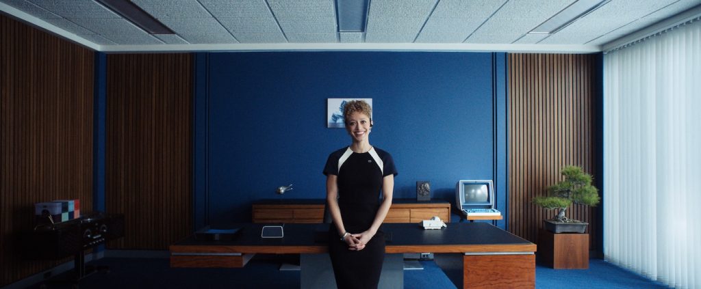
What were some of your favorite furniture or art pieces this season?
There’s so much! Fans of design often mention the furniture on the testing floor and Gemma’s suite. But one thing that people may miss is the new desk in Milchick’s office. It’s a pretty amazing piece, circa 1965 for Lehigh Leopold, designed by renowned architect Warren Platner. He worked with architects Eero Saarinen and Kevin Roche in the ’60s, who designed Bell Labs, which is our HQ for Lumon. So, it’s very likely that the desk would have been in the executive’s offices. I think we bought that from an antique store, Merit, in Los Angeles. We designed and fabricated the sofa, bed, and chair in Gemma’s suite. The idea is it’s a modular system that would’ve been maybe 3D printed by Lumon. So, we ended up 3D printing pieces of it.
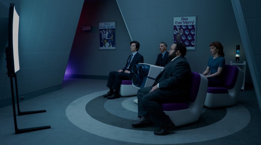
What was behind the white and purple chairs in the break room, where the innies are forced to watch that uprising reform video?
Those are the Nimrod chairs by Marc Newsom. We revamped the break room for the new and improved Lumon because they wanted to be “fun.” The projector was straight out of the ’60s. When we use an actual object, we often have to make some alterations. We painted it and created a control panel to make it feel like something Lumon would’ve created. We also fabricated the screen. The crazy balloon lamps, I just stumbled upon those and I was like, ‘These are fun! In the corners, there are some lava lamps from Ukraine. We bought quite a bit from Ukraine, like some of the toys in Dylan’s house, because I wanted things that felt a little foreign.
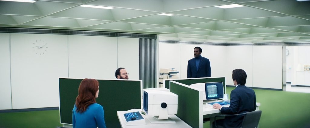
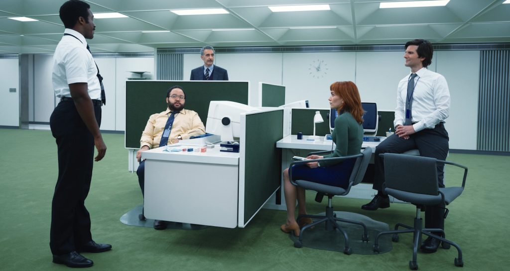
Where did you get those 1990s desktops in the cubicles?
Those were fabricated for season one, including the keyboards, I think, based on research at the Rhode Island Computer Museum, which was one of the things I’d suggested to Jeremy.
What were some of your favorite items or scenes from this season?
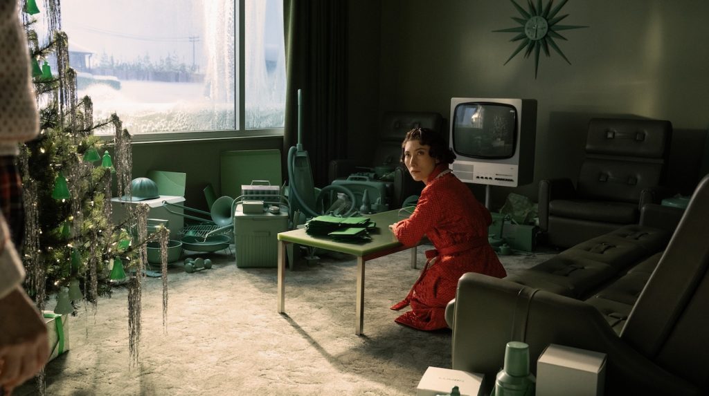
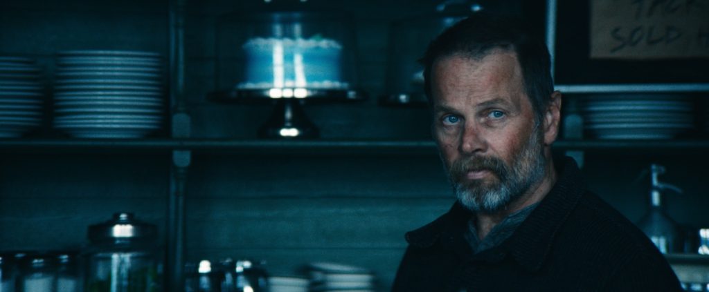
Episode Seven is probably my favorite because we covered so much; the testing floor is entirely new. We have flashbacks to Mark and Gemma’s house, Ganz College, and Gemma’s office, which are traditional sets, but they’re still packed with character—we’re trying to identify who these people are and where they come from. The Salt’s Neck episode in Newfoundland, Canada, was totally different from the rest of the show. The Drippy Pot Café at first glance feels like a regular café, but if you dig deeper, it’s very bizarre. Everything is monochromatic—there may be three colors in that whole place, which is something we do a lot with Lumon. The new visitation room is all one color. We wanted to show that Lumon has their hands in everything, even the café in this little town.
How did you decide on the color palette?
We have a pretty strict palette and camera-test a lot of our materials to maintain that palette. For instance, red is very rarely used. And if it is, it’s loaded with meaning. Blues, greens, and grays are our world.
The show has such a distinct look that really sets it apart.
This is such a unique project, and I’m really proud of the work we’ve done. We have an amazing team. The ability to fabricate so many items and create this bizarre, but not over-the-top, world that only exists in Lumon has been a great project.
Severance is streaming on Apple TV+.
Featured image: Adam Scott, John Turturro, Zach Cherry and Britt Lower in “Severance,” now streaming on Apple TV+.

