
From Bismuth Crystal Rivers to Real Neon Signs: Supervising Art Director David Scott on Designing James Gunn’s “Superman”
David Scott admits that growing up, he was more of a Batman and Spider-Man fan, but after listening to writer-director James Gunn’s pitch for Superman, which has now grossed over $550 million globally, he was excited to support the vision. “It’s infectious when you sit and listen to him talk. I loved everything about it,” says the supervising art director, who has built worlds for Guardians of the Galaxy Vol. 3, Ad Astra, and Tron: Legacy.
Color and tone were flashpoint subjects for Gunn as he wanted to break away from Zack Snyder’s darker, moodier Man of Steel (2013) and paint his own vibrant vision.“Early on, they looked at a bit of a subtler, almost period look like JFK (1991). But as we tested and started playing around with the suit from our costume designer Judianna Makovsky, who is a master at what she does, it evolved,” says Scott. What helped inform the decision-making was bringing color swatches on scouts. “Judianna would lay out all the colors, faded blues, bright blues, reds, and everything in between. They took them up to Norway and looked at them in the snow, they took them to Cleveland and looked at them in the Hall of Justice…and it was just like, what’s the best color?”
Below, Scott discusses how palette influenced design, his creative tag-team with production designer Beth Mickle, the frosty magic behind Superman’s icy home planet, and what it took to cook up that crazy anti-proton river.
What did James Gunn express during those initial production meetings that helped to guide palette and tone?
When we sat down with James, he likes to get everybody around the table and give his conceptual take on what he thinks about this whole thing. And nobody is a bigger Superman fan than him, so he had a great pitch. James wanted it to be like the comics, colorful and exciting. It’s about hope and the good in all of us.
With those ideas in mind, what is the workflow between you and production designer Beth Mickle?
Conceptually, Beth starts first, and I’m her second. We have a really good relationship and have done a number of shows together. It’s a bit of a back-and-forth thing between us. She starts and does a very high-level deep dive into the script for the big sets, the challenges, and the mood of the whole thing. We ask things like, is it going to be bright and colorful? Is it going to be primary colors? Is it going to be more subtle? And in this particular case, it really was about color because you want it to look like a comic book.
With a film of this size and budget, how did you and Beth divide and conquer?
We kind of have different roles. She’s at the very top, and all designs run through her. And with the art department, the way it breaks down is you become an assistant art director, then an art director, and then a supervising art director, and oftentimes it can get less artistic as you go. So when you get to the top, it’s more budgets, timeline, scheduling, and build. The practical. But I do love that too! And we’re a sounding board for each other so we’re always sharing ideas.
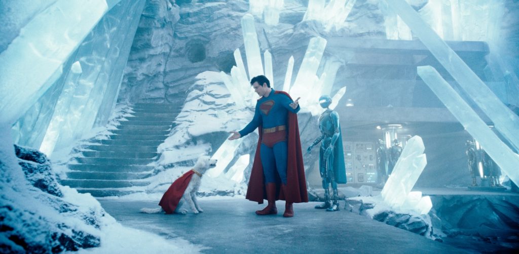
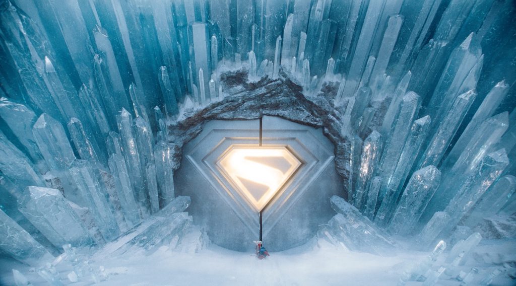
What visual references went into making Fortress of Solitude?
That was built at Trilith Studios in Atlanta on a 40,000 square foot stage that we filled to the brim. The original design is so iconic, but we asked ourselves, how do we make this better? So we wanted to do something different, but not too different, and Beth came up with the idea of it having more of an organic shape. It was driven by the idea that ice grows off itself. It’s not like everything grows at one time. Ice grows, and then melts, and then something new grows. She wanted to capture that frozen-in-time moment, so she explored the water crashing against rocks and how, when it hits, it creates these interesting sprays. We were picturing what that would look like if it actually froze in motion like that.
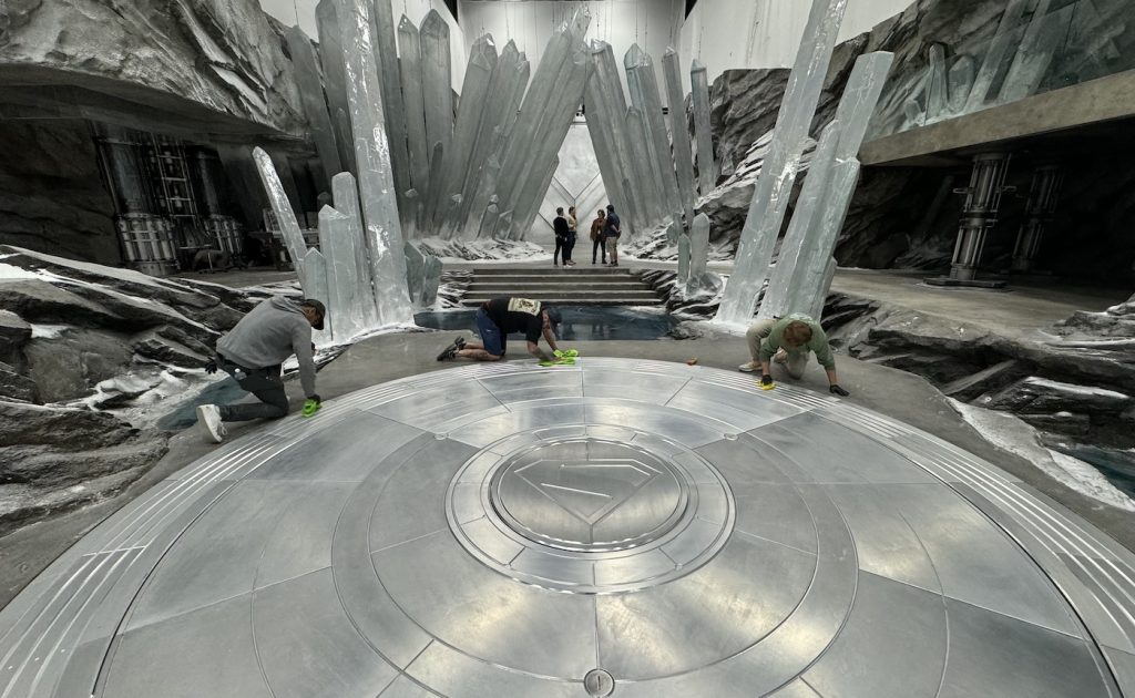
So, how did that translate into the set build?
We built the entire interior up to about 24 feet high, and then everything above that was all CG. But most everything down below that line was in camera. The crystals were made out of resin. And if you notice, looking back at the first film [Superman: The Movie, 1978], the ice crystals are solid white instead of looking like actual clear ice. That was the biggest challenge. It’s very easy to carve out Styrofoam and make these big crystals covered in snow. That’s the easy way out. But doing real translucency, where light can come through the crystals, was the biggest challenge. We experimented a lot to get to the point where we were happy.
How did the team create the exterior world when Superman first crash-lands in the snow?
They shot that whole sequence in Norway, and they actually dragged Superman in the snow by his cape up there. Beyond a few approach shots, we did a number of plates for Superman flying on location. We didn’t build anything practically in Norway. Stephane Ceretti was our visual effects supervisor, and he obviously pieced the whole sequence together between location and stage. We did build the giant Superman door on stage that they walk up to, which really moved.
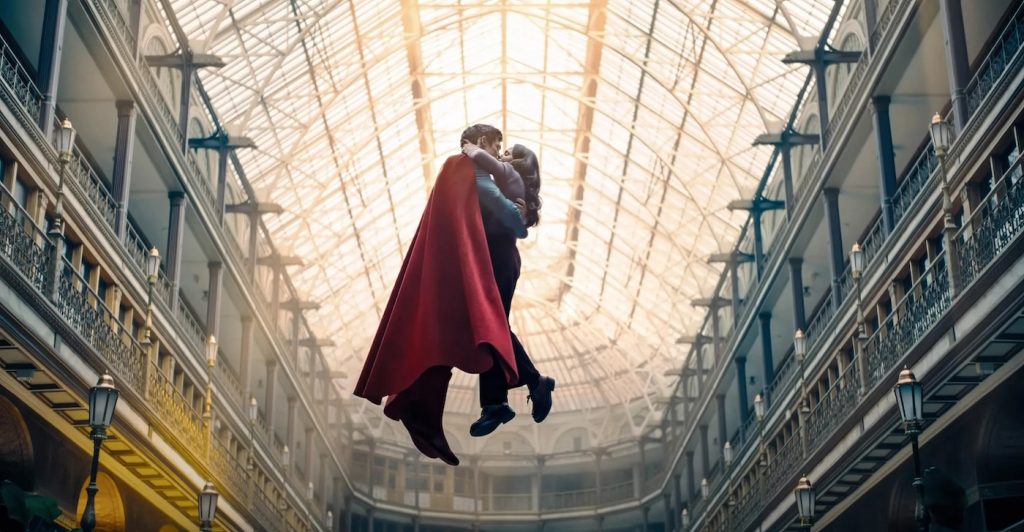
Copyright: © 2025 Warner Bros. Ent. All Rights Reserved. TM & © DC
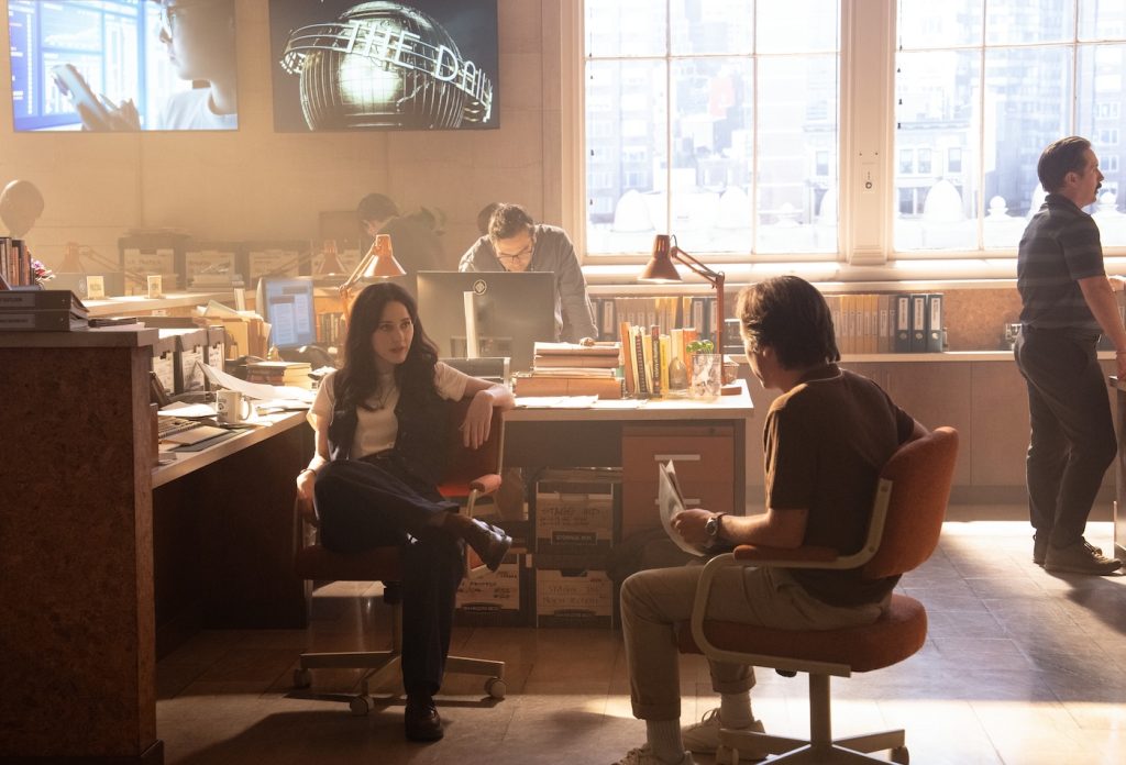
Playing in the background is a ton of graphic design and motion graphics. How did you want to stylize the new organizations of the Daily Planet, GBS News, and Sphere News?
The Daily Planet had been established, so we drew from what existed. But with GBS and Sphere, we had a more level playing field. Aesthetic wise, we wanted Sphere to kind of have an upscale look that was hip and more a cutting edge show that’s glossy and the lighting is great. The background has a big city view. And then GBS, we wanted it more straight-up news that was strictly reporting facts.
What about the graphics in Lex Luthor’s control room as he fights Superman?
Those happened with a company called Compuhire, which is a UK motion graphics company. They also worked on Guardians for us. We brought them on early to have an initial meeting with Beth and me to talk about all the needs. We knew we wouldn’t have everything 100% ready on day one, so we used generic graphics on screens for the background instead of a blue screen. This was because the fewer blue screens you have, the better it is for the budget. Then, for specific shots where the camera is looking at a screen, we have more detailed graphics that could also be replaced in post.
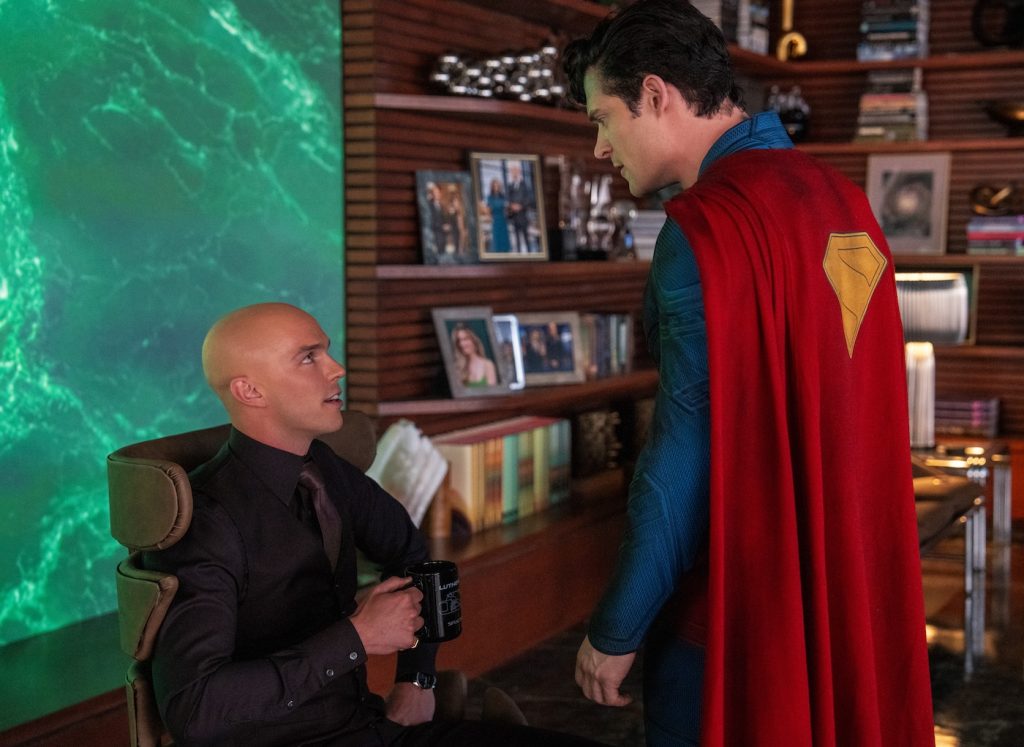
Did the team want those Lex Luthor graphics to stand out differently from others in the film?
The color palette in Lex’s world was all about green, with little hints of green marble and black. We were trying to work some purple in, which is what the comics are all about, but we ended up doing more of a limited palette. So we went with green and a brown and kind of a dirty orange look to those screens. We also pulled back out of the futuristic look into a little more, subtler, timeless sense to it.
Another sequence sees Superman clash inside a baseball stadium that was filmed inside the Cleveland Guardians’ ballpark. How did you transform it into the Superman world?
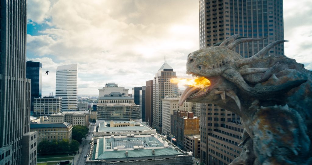
We didn’t want to see any real brands or real-world products. So the Meteors are the DC baseball team, and things like Coca-Cola became Soda Cola. Everything you see in the film is some Easter egg from the comic books. We had a digital archivist, P.J. Correa, who is as big a comic book fan as you can be, go through everything with our researcher, Samantha Avila, to build an inventory of things. Like, here’s an insurance company, a bank, here’s food companies, and drinks, all from the DC lore. We created a whole universe that doesn’t exist. James, early on, wanted everything to be from our own fictional metropolis world.
So with the stadium, our team went there with our art coordinator, Molly Flick, who went through and figured out what we had to cover. Then with Beth, we figured out the budget of how much we could cover and ended up doing the first level of where the outfield stands were, and then everything above that was all in post.
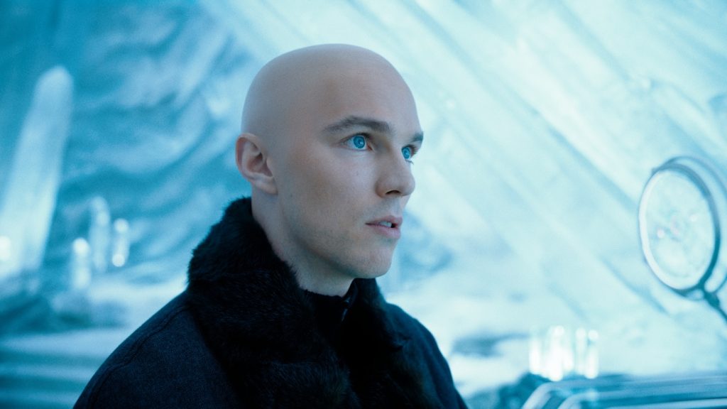
In one climactic sequence, Superman is stuck in an anti-proton river and being sucked towards a giant black hole. This is all part of the Pocket Universe Lex Luthor created to imprison his enemies. What influenced the look?
We spent countless illustrator hours working on developing different looks. We knew it needed to be otherworldly. We knew it needed to be a river. We knew it needed to have the prison. So we knew what the elements were, but what’s the aesthetic of the whole thing? So while Beth was doing the Fortress, both of us were driving the illustrators and coming up with wonderful solutions that any one of them would be great. In the end, the river was all based on a bismuth crystal.
While you were shooting in Ohio and Georgia, did you connect with local vendors to create artwork on the production?
The fun part of the job is going out on location, and in Cleveland in particular, to work with the film community. So for one, we knew we wanted to make real neon signs, and because of how big they can be, it often makes more sense to do them on location. We ended up working with a historic sign-making company that is one of the few companies left in the city that does real neon. It was great to work with all these people who are excited about the project. And that was the best thing about Cleveland. They know that Superman was invented there, and they were excited to be included. And all the credit goes to James and the producers. They made a genuine effort to engage the city and do everything right to honor the project. I think you can see the care everybody put into it. I certainly felt the heart of the whole thing when we finally saw it completed!
Superman is in theaters now.
Featured image: Caption: Nathan Fillion is Guy Gardener, Isabela Merced is Hawkgirl, and Rachel Brosnahan is Lois Lane. © 2025 Warner Bros. Ent. All Rights Reserved. TM & © DC

