
The Fittingly Frankenstein Creations of “Poor Things” Poster Designer Vasilis Marmatakis
“The movie’s poster is usually the first thing you see, so it should create an anticipation to see the film,” said Vasilis Marmatakis, the Greek graphic designer and illustrator behind the alluring poster art for Poor Things, a feminist riff on the Frankenstein legend that is up for 11 Oscars, including Best Picture. “It’s an entry point.”
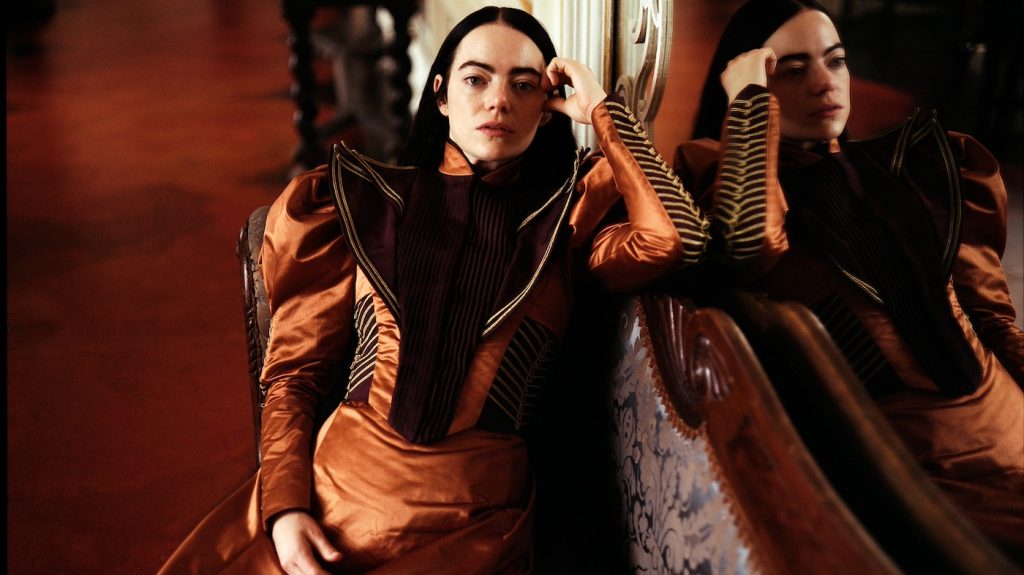
In the age of social media and star contracts, which specify their face appear front and center on promotional materials, it’s not easy to draw in audiences by simply establishing the look and feel of the movie and who’s in it. Few poster designers today wield more creative control than Marmatakis, who is known for his bold use of impressionistic typography and wonderfully strange collages that put you in the right mind-frame to see the movie — as in the photograph of Emma Stone, dressed in Victorian-era clothes, with all of her emotions metaphorically spilling out (an incongruous sight that appeared nowhere in Poor Things, but that includes various elements from the film) or Colin Farrell looming over a pair of empty hospital beds as the room eerily sinks (The Killing of a Sacred Deer). The labor-intensive designs for his poster art, which turns up in print ads and movie theater lobbies, as well as the DVD case and streaming queues, have become an integral part of their visual identity.
After studying graphic design in London at Camberwell College of Arts and the Royal College of Art in the 1990s, Marmatakis worked at an advertising agency, where he met director Yorgos Lanthimos. Their first movie poster collaboration was for Lanthimos’s breakout hit “Dogtooth,” in 2005, and featured three intersecting lines representing the distorted views of the protagonists, and lots of negative space. For 2019’s “Nimic,” a creepy, comic tale of identity theft, Marmatakis executed a graphic image that would encapsulate the entire film. One thick black brushstroke representing a man’s body disappears and is joined by another brushstroke from a woman’s body, the two lines forming a little portal.
We spoke with Marmatakis about his unusual technique and working with Lanthimos on Poor Things and the dark comedy The Favourite, which received 10 Academy Award nominations in 2018 and a Best Actress win for Olivia Colman.
Was there any specific direction given for the Poor Things poster?
It is quite interesting that I don’t get any direction from your Yorgos. This applies to all the posters I design for his films. There’s a process that’s more or less the same with everything we have worked on together so far. I usually get the script very early on and, if it’s possible, I visit the set to get a sense of what the film is going to look like — Poor Things, for example, is visually quite different from the other films of his I had worked for. Then I acquire all the photography from the set. For Poor Things, I think there must have been around 2,000 stills. I do get sent everything, not a selection, because I might need a specific element, for example, a hand or an eye or a tree. It’s very useful to have gathered all this information before I start working on a film.
Where do you usually begin?
Sometimes, what comes actually before the posters are the film’s chapter titles. I have to be very careful and precise about which typography I will use because it will probably end up on the poster, which I haven’t designed yet. For Poor Things, the chapters include these hyperreal black-and-white sequences, so I had to use a font that was very thin in order to complement and make visible what’s going on in the background. Therefore, I created a very thin and long font, like over-the-top, abnormally long. This became the initial typographic identity of the film. Then later it was developed further using a combination of three more handwritten fonts. [Our featured image is a title that Vasilis designed for us in the style he created for Poor Things.]
What were they shooting on the day you visited the set?
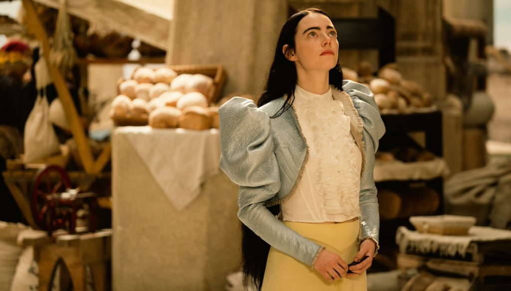
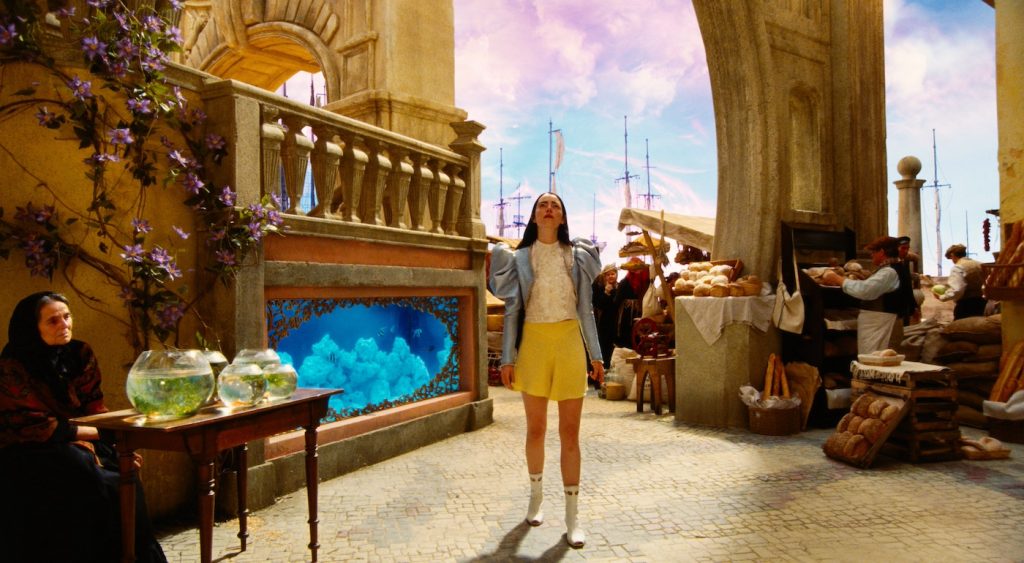
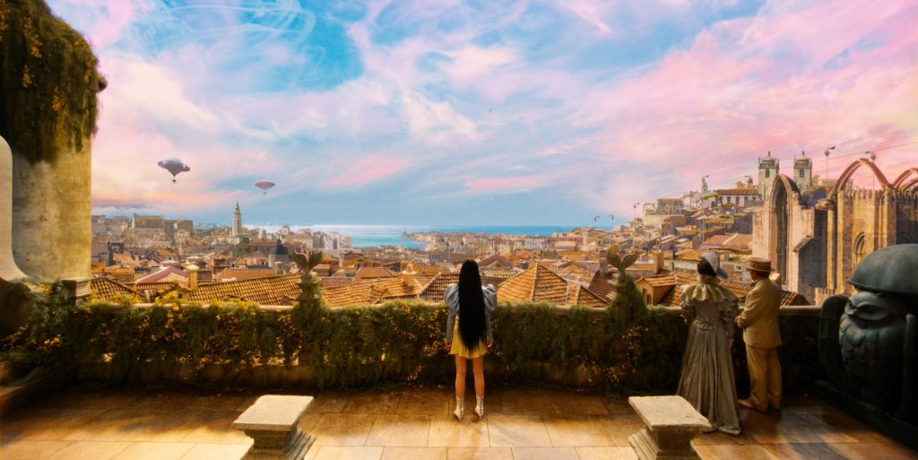
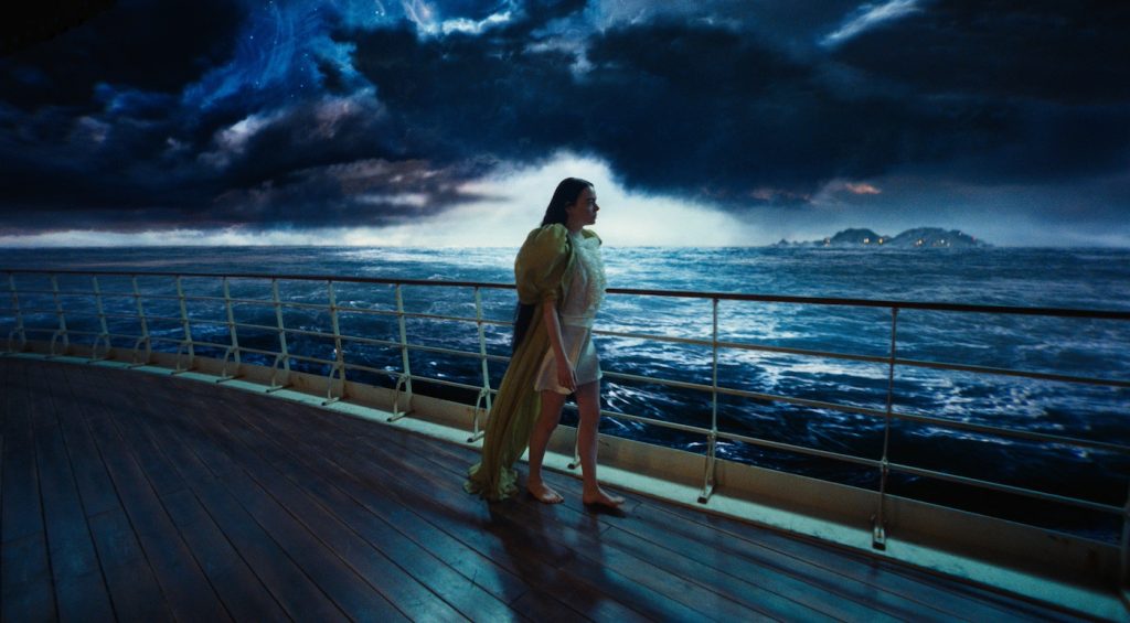
They were shooting the scene in which (the scientist Godwin Baxter) Willem Dafoe had just gotten Bella Baxter (Emma Stone) out of the water. She’s dead and lying on the medical table, and he’s about to operate on her. The other scene was with (the local cad Duncan Wedderburn) Mark Ruffalo in the tiny asylum room. In the meantime, I also had the chance to wander around in other parts of the set, including the house in London, which was absolutely amazing. Until now, Yorgos’s films didn’t include that many complicated sets, but it was mind-blowing how well-designed every single detail was for this film. I spent quite some time in there on my own, just going around looking and documenting all these decorative elements. I remember everybody was also going on about the Lisbon set, where apparently a whole city was built. Unfortunately, I didn’t have time to visit that set because it was further out from Budapest. Maybe it’s more obvious through the still photography to realize how much detail there is and how much there is to take in visually with this film. I’ve seen it a few times now, and each time I watch it I’ll focus on something else: the costumes, the backgrounds, the windows.
Where do you like to work?
I work at my studio. I kind of isolate myself, and after maybe two or three months, it depends, I tell Yorgos I’m ready, and we meet and go through the proposals. I always present very finished designs — not works in progress. I also usually try not to present them digitally or send them via mail. I do print out the posters, 70x100cm. I’m really old school with that. I like the feel of the paper and the texture. The production values are important. For example, two posters from these proposals were printed on reflective mirror-like paper. The typography and the images really looked like they were screen-printed. For Poor Things, I designed around 12 different posters. Yorgos suggested some minor changes to maybe one or two of them, and then these were presented to the producers.
Let’s talk about the poster showing Emma Stone with waves of emotion waterfalling down her open chest.
Searchlight [Pictures] suggested having one poster depicting the male characters, too. They had already worked on the image of Bella from the neck up. So this one was half-designed by me and half-designed by Searchlight. I used their upper part, and I designed the background with these hand-painted brush strokes and then composed everything from the neck down: the “guts” spilling out with the five male characters trying to balance on this uneven texture, in a way representing how all the unfiltered emotions pouring out of her, create a new environment for the men to adapt.
So the poster is actually a Frankensteining of your sensibility with the studio’s need to emphasize the film’s star power.
Bella is really childlike-honest in the film. She expresses everything that she thinks and feels, and I tried to visualize this. The “guts” are actually composed of various elements and marble objects that are found in the film. The first poster released was the one with an extreme close-up of Bella’s face with smudged makeup. If you look closely, this is not eye shadow and lipstick. These are the shapes of the main three male characters in the film. Willem Dafoe and Ramy Youssef are placed on each of Bella’s eyelids, and Mark Ruffalo is across her lips. There are three brush strokes composed out of three male figures, but these strokes are smeared, so in a way, these beauty and femininity standards are misrepresented. That’s actually my favorite poster.
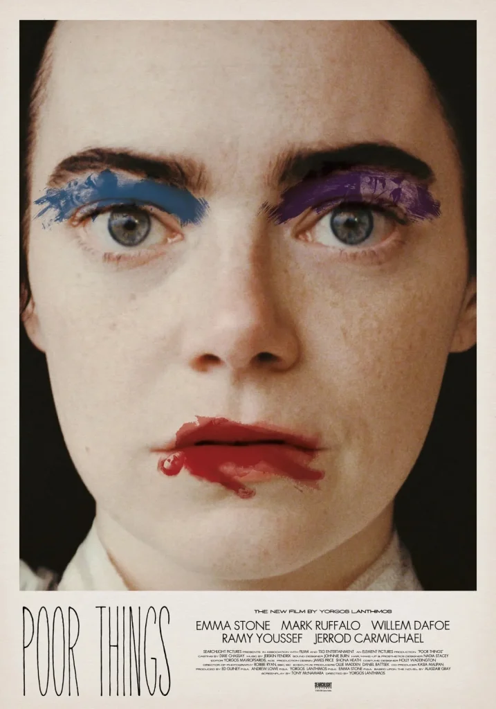
How were you able to create this surreal makeup effect?
Well, these images are handpainted. I did hundreds of brush strokes, and then I found the right figures for each actor that would fit these strokes. For example, Mark Ruffalo (as lipstick smudge), in order to have this “broken” effect, is actually composed of four different body parts taken from different photographs. Then, I digitally superimposed them on the brush strokes.
When you were designing the poster for The Favourite, you seemed to want to leave a little mystery.
With The Favourite, the idea was to use the profile image of the queen (Olivia Colman), which is the classic image you get on stamps, but there are these two extra figures (her lovers) manipulating her. You don’t know if she’s dead or if they’re decorating her or if they’re torturing her. You can’t tell. Emma Stone is holding a brush and she’s about to stroke the queen’s eyeball and Rachel Weisz sits on her lips and her crotch is blocking the queen’s breath. She’s also holding a string of pearls, kind of adorning her.
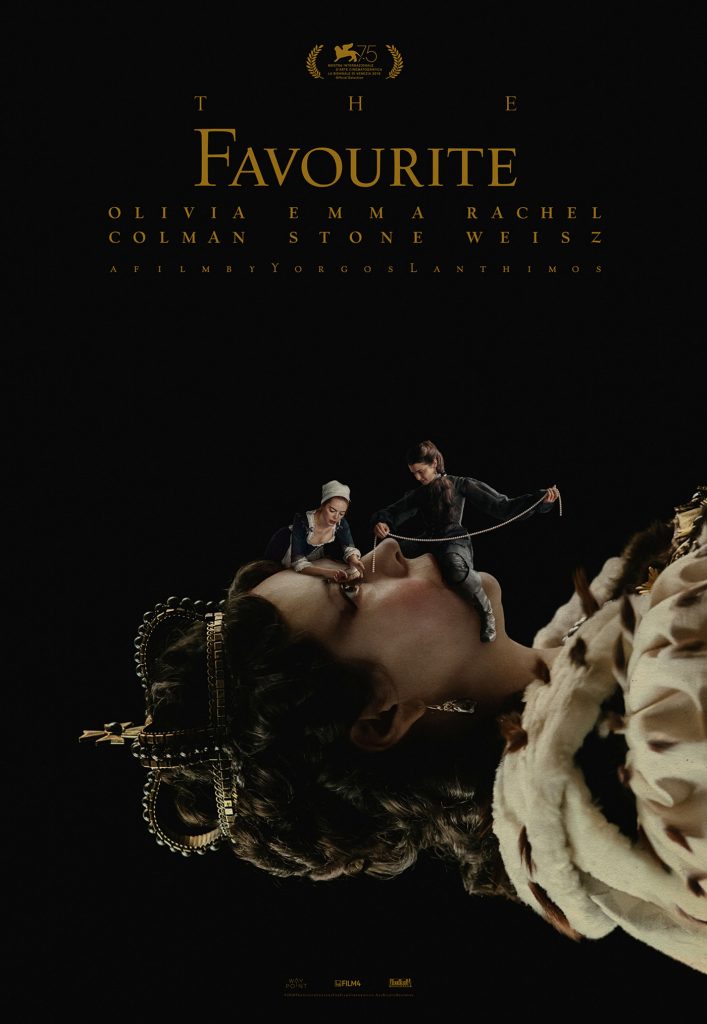
The struggle for the queen’s affections.
Earlier, I was talking about the chapters that I created for Yorgos’s films. The font used for The Favourite is called Village, and it was originally designed in the early 1900s. The typographic composition is odd. The longest word dictates the spacing of every other word, resulting in extremely spaced-out kerning. It is inspired by the letterpress typography of that time, and it comments on the over-the-top visual elements of the film. The same applies for the title of Poor Things. I had to create a typographic style that could somehow belong to the subversive logic of Bella Baxter.
For more on Poor Things, check out these stories:
“Poor Things” Pops in Venice as Emma Stone Earns Raves in Yorgos Lanthimos’s Stunner
Featured image: (From L-R): Ramy Youssef, Emma Stone, Vicki Pepperdine and Willem Dafoe in POOR THINGS. Photo by Atsushi Nishijima, Courtesy of Searchlight Pictures. © 2023 Searchlight Pictures All Rights Reserved.

