

“Poor Things” Costume Designer Holly Waddington on Bringing Yorgos Langthimos’ Ecstatic Vision to Life
Before costume designer Holly Waddington got started on Poor Things, Yorgos Lanthimos gave her a visual reference: inflatable pants. The futuristic-seeming trousers made by London College of Fashion graduate Harikrishnan buck the movie’s late-19th-century setting, which encouraged Waddington to ignore the norms of time and space. No material would be too anachronistic, no fit too audacious. “I designed a whole series of things based on this idea of inflation and compression,” she says. “It was quite wild what I came up with in response to that.”
Waddington’s eclectic clothing aligns perfectly with Poor Things‘ eclectic story. The Frankenstein riff, adapted from Alisdair Gray’s 1992 novel of the same name, follows Bella Baxer (Emma Stone) as she discovers language, sex, and societal expectations anew. Bella has been reanimated with a childlike brain thanks to a slightly mad Victorian scientist (Willem Dafoe) who sets out to observe her body and mind gradually synchronizing. Bella’s wardrobe is key to her growth. The movie introduces her in what often look like baby-doll dresses, but her fashion becomes more sophisticated as she explores the world and develops unadulterated ideas about how to live in it.
After those inflatable pants jump-started Waddington’s initial brainstorm, her work zigged and zagged as the rest of the movie fell into place. Now an Oscar contender for the film, Waddington, whose past credits include Lady Macbeth and Hulu’s The Great, was able to blend a medley of sensibilities into one eye-popping palette.
Did you know from the outset how hyper-saturated a lot of Poor Things‘ colors would be?
I had this whole journey of exploring these lung-shaped sleeves and plasticity — things that breathe and deflate. Then we had a series of meetings on Zoom, and it was really only at that point that Yorgos showed me what they’d done in the art department. I knew it was going to be rich and elaborate because I was already a big fan of [production designer] Shona Heath’s fashion work. But I was absolutely overwhelmed when I was given this bible, which was this massive, absolutely incredible 200-page document full of descriptions and references and beautiful concept work. Then, I really had something to work with.
How much of what you developed independent of that bible is what we see in the film?
A lot of it shifted because I was really encouraged by Yorgos to just go big. What we ended up with had a lot to do with texture — big textures in the clothing, things that felt organic, things that felt inflated. That manifested itself in the sleeves but not in the way that I had delivered it in this early rendition.
What did it look like at first?
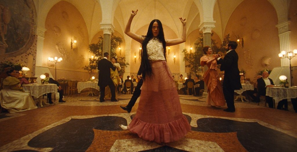
In the beginning, all the big sleeves were for the men. I had a lot of ideas to begin with. It was quite grotesque originally, but Yorgos zoomed in on these images I had of these 1890s sleeves. That was very much his choice — but for the women, not the men, and specifically for Bella. I think he made a very good choice there because those sleeves are incredibly empowering to wear. They really emphasize her otherness. They also transpose into these richly textured fabrics. They feel like a sea creature.
She has an otherworldliness about her because of how her brain functions. As there are in children, there’s a bit of animalistic behavior going on.
Yes. He was very clear about that.
What other kinds of references did that 200-page document contain? I’d assume Victorian, steampunk, and modish stuff from the ’60s.
No steampunk. I know a lot of people have described the work as being steampunk, but we were actually asked not to look at steampunk at all. I don’t think it’s an aesthetic Yorgos is particularly drawn to. But yes, definitely ’60s: André Courrèges, Pierre Cardin, Paco Rabanne, and designers who were doing that whole space-age thing. We referenced astronauts and going to the moon. I was lifting little bits from these designers, like the peep-toe boots that Bella Baxter wears. André Courrèges’ had zips up the back, so we merged that with the Victoria bootie.
Were there any paintings or films referenced in that book?
Paintings, yes. Loads of stuff. And I had masses of stuff, too. I had lots of Otto Dix paintings and German expressionist paintings. The colors often came from those pictures, as well as John Singer Sargent and other things. One of the references that Yorgos had come up with was [Austrian painter] Egon Schiele, this scratchy drawing of a Victorian girl with incredibly long black hair. I’ve heard that production designers were given lists of films, but I didn’t have that.
Did you make everything from scratch, or did you find vintage and archival stuff?
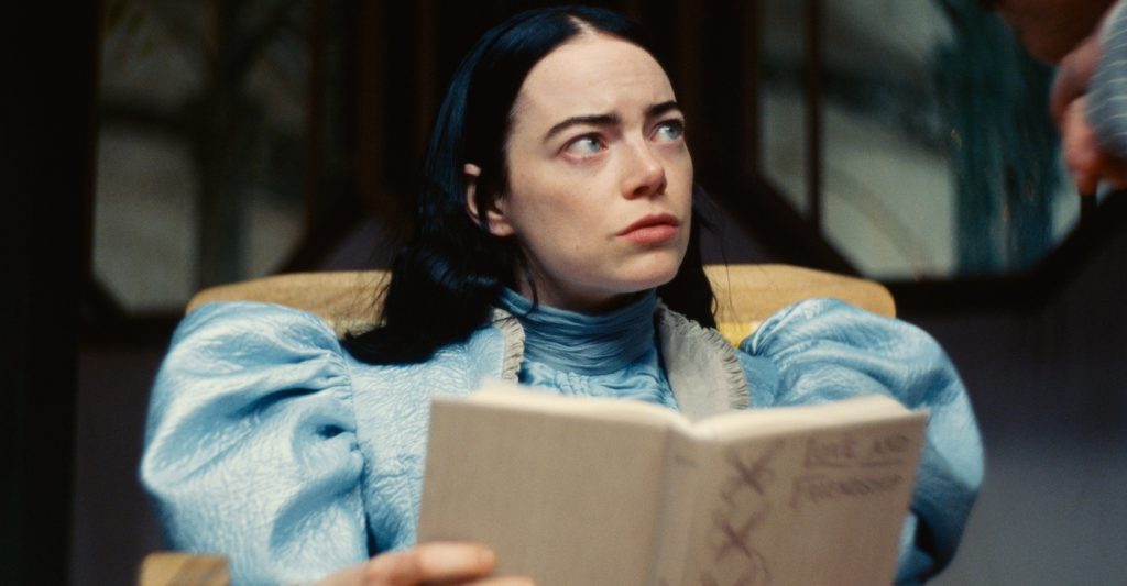
For the principals, everything was made. There are pieces where I might have found something original, and then I looked at it and designed a version of it. An example would be the little frilly ivory thing that she wears underneath a few of the outfits. She wears it quite often. Nowadays, we’d call it a sleeveless blouse. The Victorian women called them modesty pieces. They filled the empty space around the neck and the chest because you’d only expose that part for evening wear in those days. They’re like bibs, and I quite like having that as a thing that she’d wear. As soon as you start going down that route of making everything, if you try to pepper in an original Victorian thing, it looks historical. It doesn’t sit well within the textures.
How much did you use period-appropriate fabrics? I assume you didn’t have to.
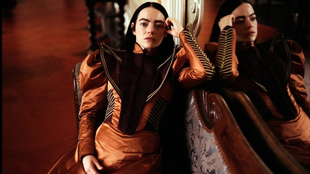
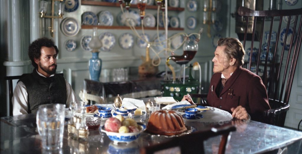
I didn’t, but some of the fabrics are really period-appropriate. Some of the bodices and that blue dress at the beginning, and the wool jacket are made in traditional fabrics that you’d use if you were doing a period drama. You can never fully recreate these things, but it’s striving for what the Victorians would have used. But then there were many other fabrics that were not typical of the period. I used a lot of polyurethane and latex. A lot of the blouse fabrics are very light, contemporary silks that have been woven in interesting ways. Madame Swiney [the brothel owner played by Kathryn Hunter] wears this dressing gown that we had woven by a British company to look almost like varicose veins. And Baxter [played by Dafoe] wears a smoking jacket that is quilted and woven in a very modern way. I was mixing and matching.
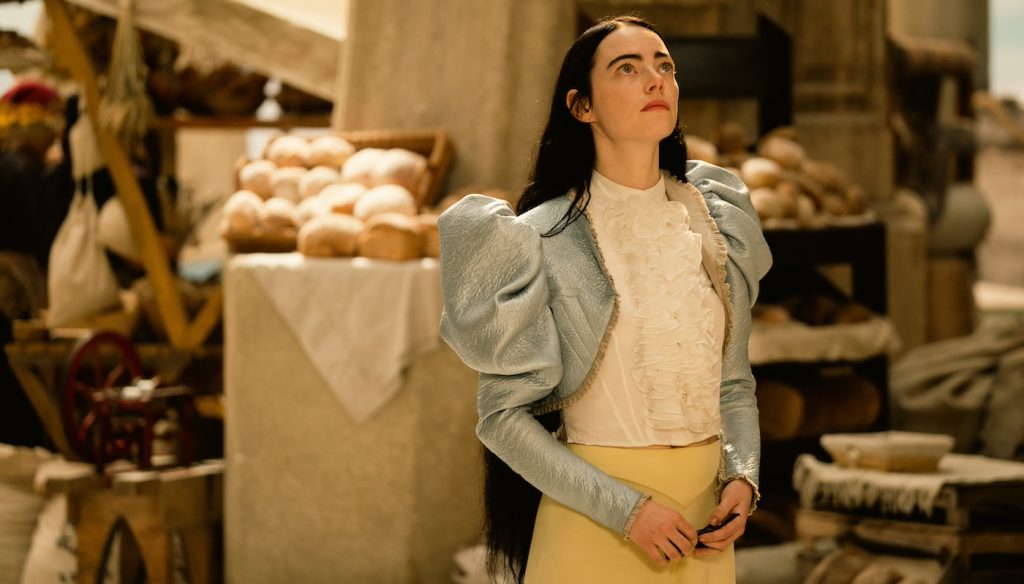
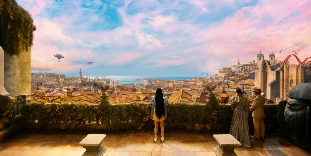
Once Bella sets out on her adventures through Lisbon and Paris, the visual palette becomes very rich and hyper-saturated. The clothes are all these vibrant yellows and baby blues. Were those shades informed at all by the ornate sets or the overly lit skies?
To a large degree. But if I’m truly honest, I think I’m choosing colors based ultimately on what is right for Bella. I wasn’t thinking, “Oh, I must dress her in yellow because this set has lots of yellow in it.” When she arrives in Lisbon, the world has only been black and white. We didn’t know that as creators. That was a very late decision, although we think Yorgos probably knew the whole time. In Lisbon, the whole world is like an explosion of color. I was very much wanting to align my costume choices so those yellows and golds felt like colors that belonged in that world. There’s a softness to them at that point. They’re still very childlike. With the black hair, her wearing a lot of yellow felt like a bold choice. Yellow and black are nature’s warning colors. Wasps and bees are black and yellow, and in the urban world, caution tape is yellow. She is not to be ignored, and I wanted her to be incredibly conspicuous.
What was the most decadent outfit to design?
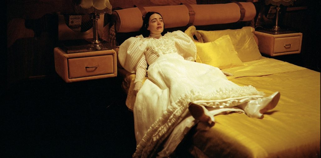
The wedding dress, in terms of how much I was asking of my team. The cutters had to do a lot because it’s made of flimsy nothingness, really. It’s fabrics that are hard to work with because they’re so light. It’s a layer of organza followed by a layer of millinery netting, which is basically plastic, followed by a layer of cotton tulle, and then it has these bands of nylon that are wrapped in the flimsiest habutai silk. And then the sleeves had to be inflated like balloons with no visible structure inside them. They needed to look like clouds. It’s quite decadent in its labor, but it doesn’t necessarily look like the most decadent thing.
Did anyone reference Frankenstein at all?
I started reading it when we were working on the film, but I quickly stopped. Have you read Frankenstein recently? It’s quite dense. We were not having conversations about Frankenstein at all, which is interesting when you look at what we came up with. The black hair is quite Gothic. Yorgos works more instinctively.
Poor Things is in theaters on December 8.
Featured image: Emma Stone in POOR THINGS. Courtesy of Searchlight Pictures. © 2023 Searchlight Pictures All Rights Reserved.

