

Best of 2022: Getting Sea Sick With “Triangle of Sadness” Production Designer Josefin Åsberg
It’s that time of year—we look back on a few of our favorite interviews from 2022 in our annual year-end list.
Satirical black comedy Triangle of Sadness, writer/director Ruben Östlund’s first English-language feature, debuted at the 2022 Cannes Film Festival, where it won the Palme d’Or. The Swedish auteur is known for 2014’s Force Majeure and The Square, which in 2017 also won the Palme d’Or and was nominated for a Best Foreign Language Film Oscar.
Triangle of Sadness, like Östlund’s previous films, examines classism and the decadence of the famous and the ultra-rich. It is broken into three segments. The first centers on high fashion models Carl (Harris Dickinson) and Yaya (Charlbi Dean), and how their relationship is impacted by Carl’s dimming value as a male model and Yaya’s greater financial success. The second follows Carl and Yaya’s travels on a super yacht helmed by a Marxist captain (Woody Harrelson). The night of the captain’s haute cuisine dinner, a dangerous storm wreaks havoc on the stomachs of the yacht guests and the yacht itself. The third and last segment takes place on a remote island, where survivors from the yacht find themselves in a new class hierarchy, in which the yacht’s domestic manager Abigail (Dolly de Leon), the only one among them who knows how to fish or start a fire, reigns supreme.
Production designer Josefin Åsberg, Östlund’s longtime collaborator, had a lot to consider in her job of designing the look and feel of the film. Not least was how to realistically present a yacht with environments befitting the elite and ultra-rich. She also had to make the copious amount of vomit and sewage flowing at the crescendo of the yacht scenes as believable as they were gross. Of course, The Credits, just like you, wanted to know all about that.
There are three distinct sections to the film. The first one has stark contrasts in parts, which seems to be very intentional. It’s very white, but at one point the characters are splashed with bright paint, so it’s a bit of an introduction and preparing you for the second segment.
It partly took place in the fashion world. It’s quite limited in the sense that it’s a hotel, a catwalk, and auditions. We wanted to make it visually of a piece with the rest of the film. We didn’t want it to look totally different from the rest. Other than the bright splashes, it’s very discreet, color-wise. It’s very subdued.
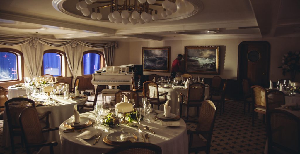
In terms of the yacht in section two, Ruben Östlund is quoted as saying that you had incredible detail in your production design. What considerations did you have, both in terms of how super yachts look and how their opulence relates to the story?
We knew we were looking for a quite classic yacht. I took the measurements for the windows from the actual yacht for the set in the studio, but then I was quite free to design the interiors. We made the dining room with the area outside, the corridors with the cabins with the toilets and bathrooms. We also wanted to control the movement because the bad weather increases during the captain’s dinner, so it was also a lot of fun to plan and think about ideas. We tested different angles on a small gimbal. When does it start to get difficult to walk? When do things start to slide? We build the set two meters up on a hydraulic platform; then, we could control having slight movement in the beginning, and then as the chaos comes closer and closer, we can make it more and more intense.
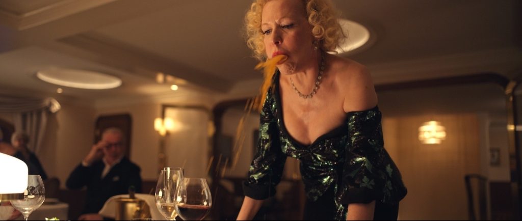
Let’s talk about the captain’s dinner. How did you decide what kind of foods to use and how that would relate to the seasickness that takes over the diners?
Regarding the food, we knew it should, at first, not look disgusting. For example, with oysters, if you’re not seasick, they’re great. Then we wanted to add some green syrup or something that looked a little bit odd. If you’re seasick, you’re so sensitive. We also had this huge octopus arm with big suckers.
That’s when it starts going off the rails.
Yeah. That octopus looks almost like a burnt arm. Octopus is tasty if you’re on land, but when you’re seasick, it’s the worst food you could have. At the same time, we didn’t want to make it too much like a joke. We had a fine dining chef. We discussed with him how food might look in a very high-caliber restaurant. Maybe put some flowers on it so it looks elegant and tasty. Actually, we originally planned for three dishes, but on the morning of the shoot, I met with Ruben, we stayed in the same hotel and had breakfast, and he said it would be fun if we could add five more dishes.
Did you have to consider, as a production designer, what food would create the most interesting or artistic vomit?
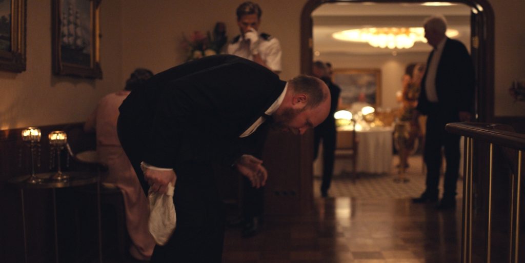
You could see the looks whenever the next dish is arriving. They’re presenting them, like, “da da da dah!” taking away the cloche, and the diners can’t stand it. We made a lot of tests of the puke, depending on the character. This is a character that loves red wine, which would make the puke a little bit pink. With another who loves champagne, it’s more frothy. Then maybe we put some pieces of an octopus or some shrimp or something. There were some fun discussions regarding this whole scene. When we made a test, at first, we didn’t have any carpet in the dining room, but then all the furniture came sliding when the rocking was starting to get really bad and crescendo. We decided it would be too much. It’s intense as it is, with the food and the puke. If everyone is also sliding, then it would be too much. I said, “Let’s have a white carpet.” That’s much more painful if someone pukes on a white carpet. We also looked at the different colors for the sh*t when the toilets explode.
It’s certainly a very particular look, where there can be no question of what is covering the floors of the yacht.
We did a test with a toilet in the studio. At first, they made it a little bit too orange, so it looked a little bit too much like the puke. Then it was a little bit too dark brown, so we had to work on it a while. It also was like whole systems are in collapse, so then it needs to have water mixing in because it’s raw sewage and ocean water. At first, somebody scheduled that scene on the second shooting week. I said, “That’s not possible; of course, an exploding toilet system needs to be the last day of the shoot.”
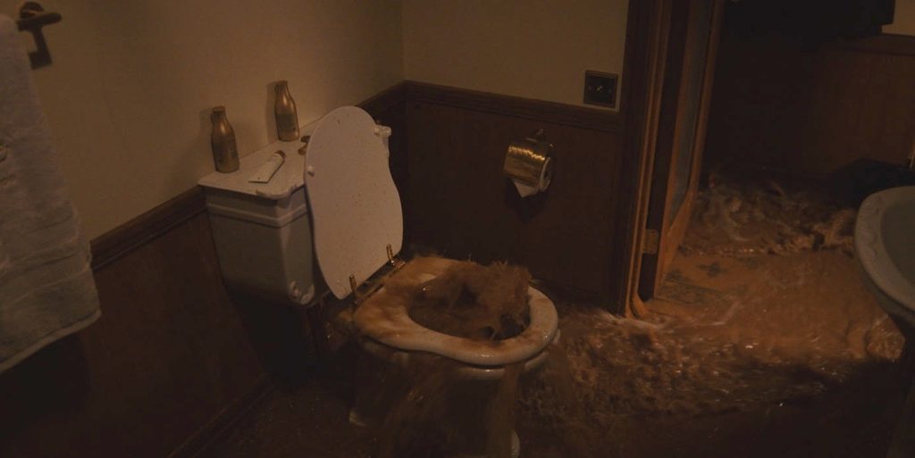
What’s great about that scene is the metaphor about everything breaking down. It has to be that intense and over the top.
It was like the end of the human being. Everything is breaking down. At the same time as all the puking and sewage, the captain is repeating, “The ship is going under. The ship is going under.” Everything visually and in the script is combined into a catastrophe.
The third segment is on an island with the elite as castaways. How did you approach that?
We found this beach in Greece. It was a nudist beach at the end of a small beach town. We were there after all the tourists had left. We cleaned the beach and added a lot of greenery. W discussed how clean the beach needed to be and how many big tree branches we needed. We wanted to have plastic chairs or things that look like they came on the yacht and floated onto the beach. It’s never clear where they are. Are they in Europe? Are they on a Pacific coast island? We wanted it to be unspecific. We didn’t need to add tropical greenery. It was not a jungle, but we needed to make it feel like it was someplace a luxury yacht would go, like a quite nice island.
As the production designer on the film, what are you most proud of that viewers might not notice but you know really works?
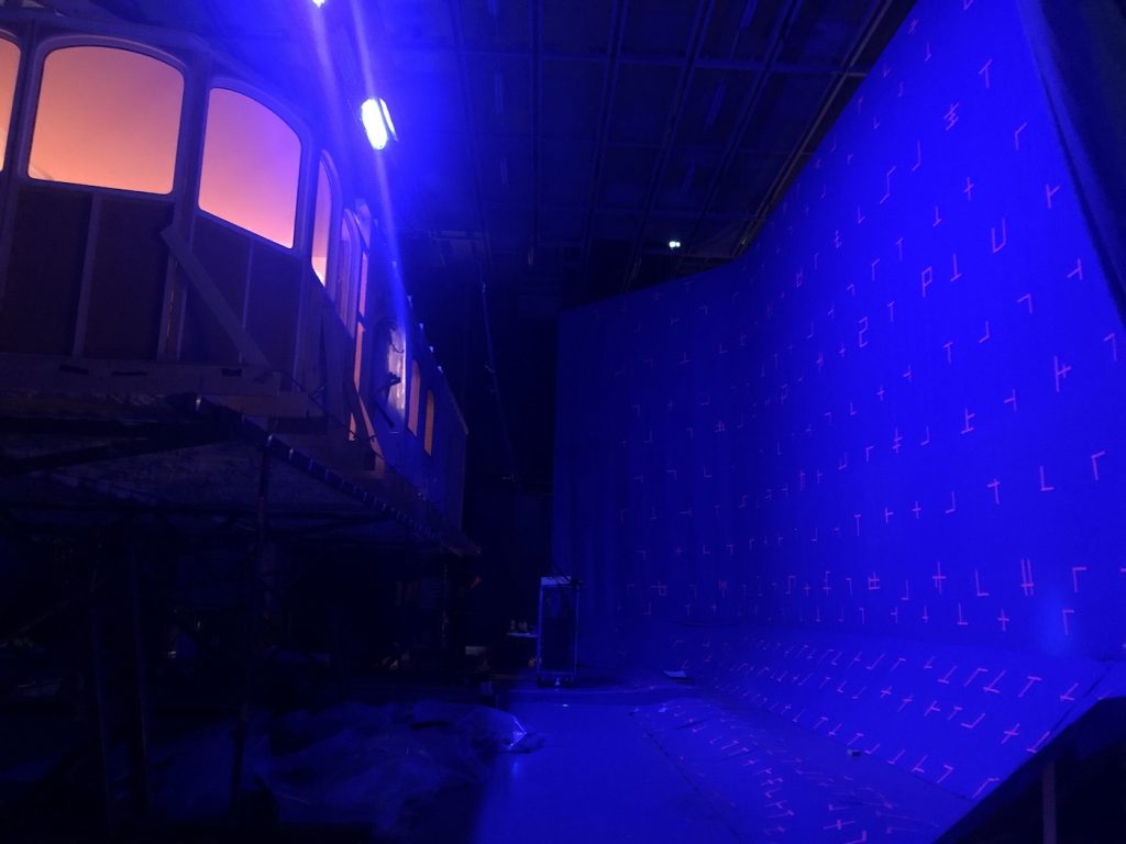
I’d say the fact that a lot of the scenes on the yacht are filmed in a studio. The goal is for audiences not to notice and just feel it is part of the story, not set apart. There’s the platform two meters up that allows for the rocking in the storm at sea, all in the studio, and when I tell people, they can’t imagine that. That makes me very proud.
Triangle of Sadness is in select theaters and available for rent or purchase on Vudu and Prime Video.
Featured image: L-r: Charlbi Dean and Harris Dickinson in “Triangle of Sadness.” Courtesy Neon.

