

Emmy-Nominated “Watchmen” Production Designer on The Show’s Eclectic Inspirations
Not only did Watchmen top all TV rivals by earning 26 Emmy nominations; the sprawling HBO series also tackled racism in America en route to becoming arguably the most topical drama of the year. Rooted in the horrific 1921 Tulsa Race Massacre of more than 300 Black citizens, Watchmen pits fictional superhero Sister Night (Regina King) against a secret society of white supremacists Hell-bent on taking over the world.
Damon Lindelof (Lost, The Leftovers) created the show as a contemporary sequel to Dave Gibbons and Alan Moore’s 1987 graphic novel. The eye-popping “alternative history” hopscotches over time and space, touching down in Saigon, Harlem, the North Pole, a Hoboken carnival, and a moon of Jupiter. The man charged with assembling all these environments into a cohesive whole is UK-by-way-of-Denmark production designer Kristian Milsted (Killing Eve).
Emmy nominee Milsted spent 11 and a half months in Georgia, where his team eventually commandeered all six soundstages at Atlanta Metro Studios. “It was almost like designing nine stand-alone features,” says Milsted, who joined the production after Mark Worthington designed the pilot episode. (Additionally, David Lee designed Jeremy Irons’ “Europa” sequences on location in Wales).
“For example, episode six is in black and white and uses a completely different language than episode seven, and yet they can’t feel incongruous,” he continues. “In many ways, the show’s quite grounded, being set in Tulsa, but then there’s also this sci-fi element, with teleportation and space travel. One of my big jobs, working with the directors, the DP and Damon [Lindelof], had to do with ‘How do we make Watchmen feel like one show?’, because we didn’t want it to be a Tales From the Crypt type anthology series. For me, it was a great joy being able to solve that puzzle.”
Speaking by Zoom from his South London home, Milsted opened up about the real-world inspirations that informed the fantastical world-building of Watchmen, ranging from Spanish radio towers and Leonardo da Vinci to American hamburger chains and Doomsday Preppers.
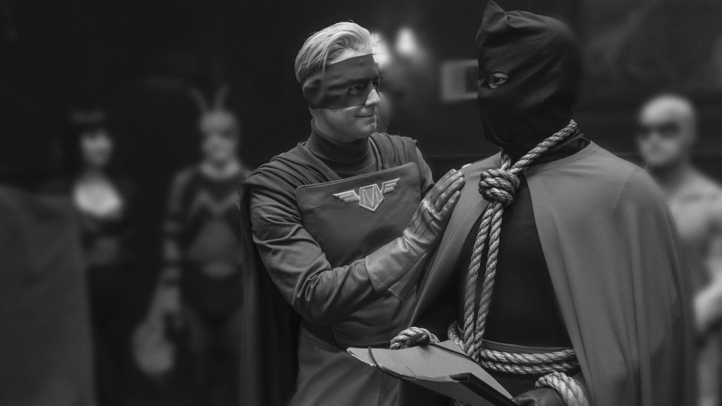
Regina King stars as anti-racist cop Angela Abar AKA Sister Night, who pretends to run a bakery. But there’s more to it than that?
Sister Night’s kids think she’s starting a bakery on High Street in modern-day Greenwood. That’s her front, but in the back, she has what we call the Night Lair, where she keeps her really cool uniform and the cool-ass car. Angela’s lair is inspired by Nite Owl from the comic. As much as possible, Damon wanted us to take references from the original graphic novel. I’d been a fan of the comic as a kid, and when I got the call to do the show, it all came flooding back.
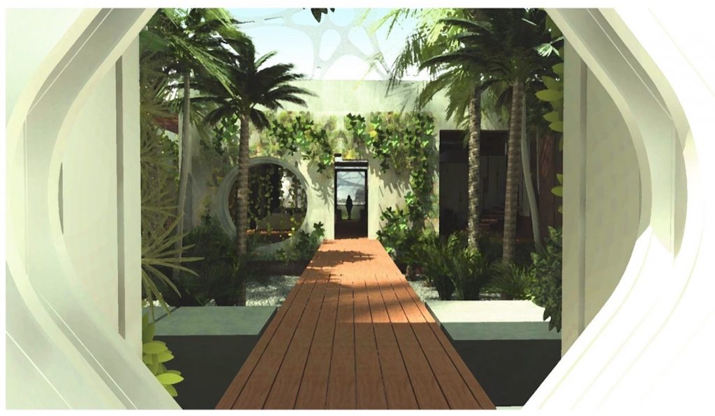
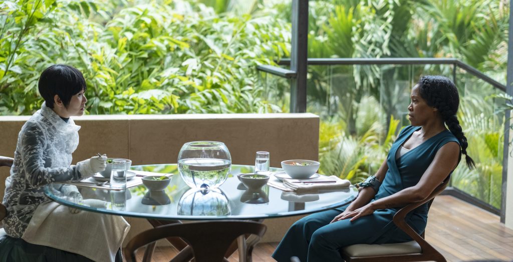
Visionary billionaire Lady Trieu, played by Hong Chau, runs this huge sphere-shaped compound filled with plants. Why all the greenery?
Lady Trieu vowed to her mother that she would never leave Vietnam, so when she does eventually leave to build the Millennium Clock in Tulsa, Damon’s brief for the compound was, “I want Lady Trieu to sit in the jungle.” The space needed to be impressive and we needed to have jungle permeating the whole structure. We built her compound based on a dome structure inspired by Brutalism architecture and this Italian architect Carlo Scarpa, who built some great structures in Venice. I was there on holiday when Damon called me about working on Watchmen, so that may have come into it.

Looming over Lady Trieu’s compound is the Millennium Clock, which dominates the skyline with its soaring, graceful silhouette. What were your real-world references for the Millennium Clock?
I’m giving all my secrets away—there’s an arched radio tower in Barcelona by the Spanish architect Santiago Calatrava, which looks like an elongated number 2. We made two of those [towers] that came up like that. The Clock was also inspired by Victorian sundials, which show the positions of the planet, and I took a little bit from Jody Foster’s movie Contact. We gave the visual effects teams lots of drawings of what we thought the Clock should look like and they stayed fairly true to the shape.
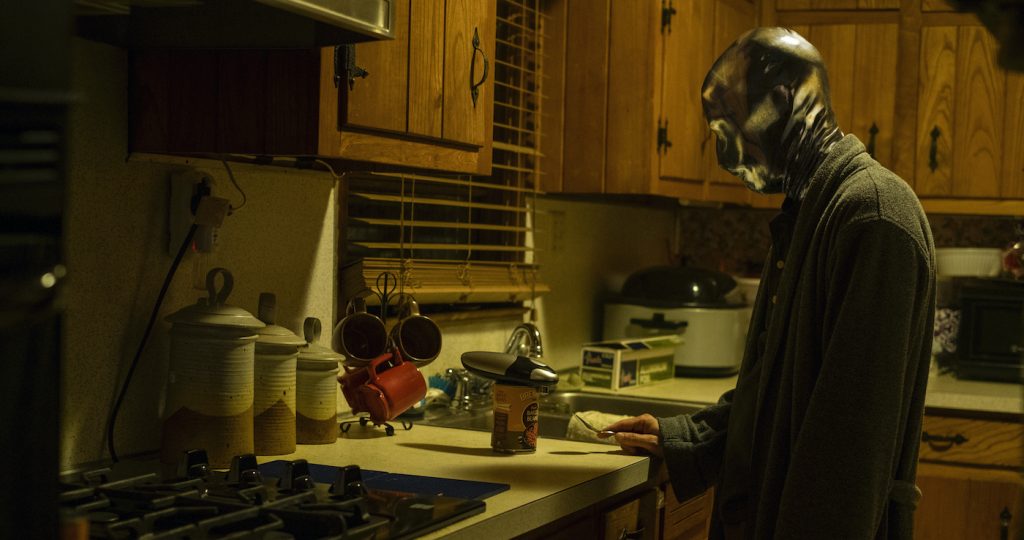
Tim Blake Nelson’s character Wade, AKA Looking Glass, has this odd bomb shelter in his backyard. What’s that about?
We call it the Squid Shelter. Tim Blake Nelson’s character is terrified about another squid attack since the first one in 1985 completely changed his life. He’s a nervous wreck, and the Squid Shelter is the only place where he can really relax. Tim’s a prepper, like those guys in America who are prepared for any kind of eventual disaster. Tonally, the color scheme was very reminiscent of the graphic novel so we gave the shelter weird blends of tertiary colors, greens, and yellows, purples.
And the entrance to the Squid Shelter opens with a wheel?
Yeah, like in a submarine. Sometimes you do something just because it’s cool. Why do a handle when you can have a submarine wheel?
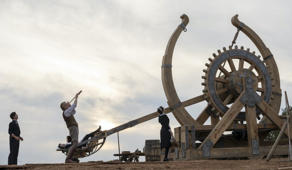
Jeremy Irons as genius scientist Adrian Veidt shot most of his scenes in Wales, but he came to Atlanta to operate the spectacular Steam Punk style catapult that hurls clones hundreds of miles into space. Did that thing actually work?
The catapult was inspired by a Leonard da Vinci design. It seemed to me like such an iconic Watchmen image, with the clock face and the arm looking almost like the dial of a watch face. When I showed the references to Damon, he loved it. The catapult we constructed did mechanically pull back but we couldn’t make the ropes work properly, so it wasn’t a fully functioning catapult. We would have probably killed people if that had been the case because it was quite big, about 22 feet high. But everything you see is real except for the firing of people, which was done with vis effects animation.
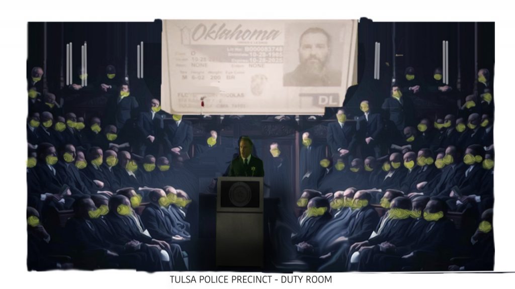
“The Precinct,” where mask-wearing Tulsa cops get their marching orders from the police chief, seems both spooky and majestic at the same time.
I ‘m particularly happy with this very strange police station because it’s shaped like the House of Parliament. You have someone standing at one end speaking, and then two sloped seating areas where all the cops sit in their yellow masks. I don’t like to shock people out of the drama they’re watching, but I do like to challenge the audience.
Watchmen has a lot to say about racism and American politics. White supremacists live in Nixonville, an enclave of trailer homes anchored by a giant statue of the disgraced president. What was the inspiration for your Nixon?
Damon liked the idea of Nixon looking like that burger chain.
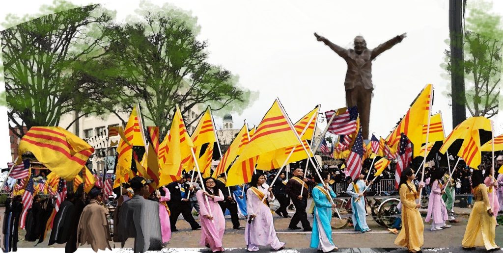
Bob’s Big Boy?
Yeah, Damon wanted Nixon to look like Big Bob. So I found a Nixon caricature with this very big head, holding his hands up in the air and we made a three-D rendering. We sculpted the legs from fiberglass and gave it to visual effects to finish. I worked closely with visual effects supervisor Erik Henry throughout the show. Ideally, we were able to achieve a seamless cross over between design and vis effects because it’s all coming conceptually from one place: Damon’s head.
Featured image: Regina King, Yahya Abdul-Mateen II. Photograph by Mark Hill/HBO

